Brand Identity
The corporate style of ADPK visually reflects the College's values, history and vision for the future. These standards must be observed in all official documents, digital materials and the physical environment.
Color Palette
Navy – Primary Color
#0B1437
Used for headings, navigation, the footer and official backgrounds.
RGB: 11, 20, 55
CMYK: 80,64,0,78
Gold – Accent Color
#F59E0B
Used for buttons, icons, accents and interactive elements.
RGB: 245, 158, 11
CMYK: 0,36,96,4
White – Background Color
#FFFFFF
Used for the main background, card backgrounds and text areas.
RGB: 255, 255, 255
CMYK: 0,0,0,0
#0f1e4a
Navy-800
Navy-800
#D97706
Gold-600
Gold-600
#FBBF24
Gold-400
Gold-400
#F1F5F9
Slate-100
Slate-100
Typography
Heading Font
Playfair Display
Used for all headings (H1–H3). Bold (700) and ExtraBold (800) weights.
H1 – 3.2rem / 800
H2 – 2rem / 700
H3 – 1.4rem / 700
Primary Font
Inter
Used for all body text, navigation and buttons. All weights from 300 to 900.
ExtraBold (800) – Key emphasis
SemiBold (600) – Subheadings
Regular (400) – Body text
Light (300) – Supporting text
Logo
Logo composition and explanation
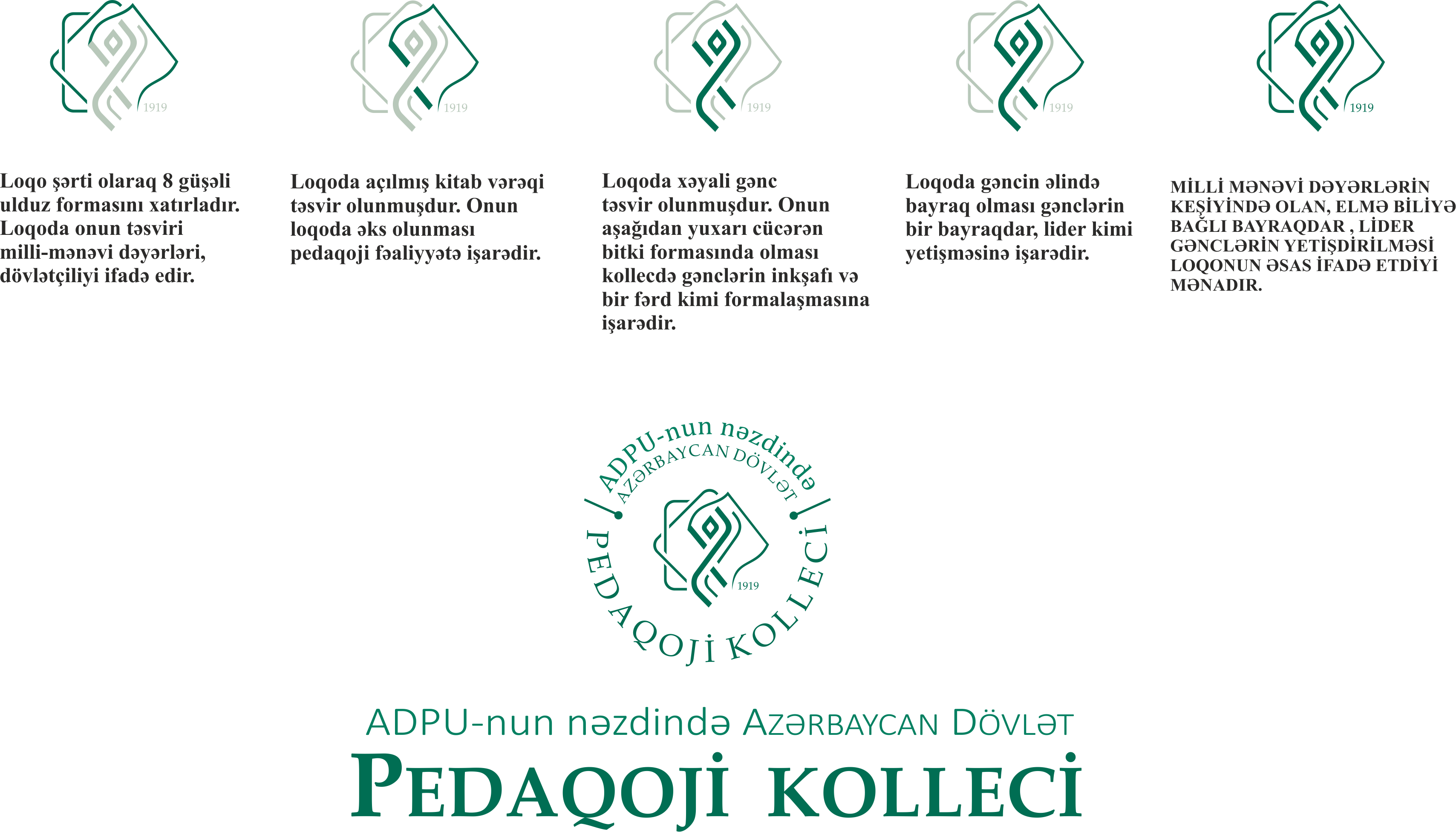
Correct use
- Color logo on a white background
- White logo on a dark background
- Minimum size: 80px wide
- Proportional resizing
Incorrect use
- Changing the colors
- Distorting the proportions
- Busy, complex backgrounds
- Adding effects and shadows
File formats
- SVG – For the web
- PNG – Digital materials
- PDF – Print materials
- AI/EPS – For design
ADPK
Azerbaijan State Pedagogical College
ADPK
Azerbaijan State Pedagogical College
Icon System
Font Awesome 6 icons are used across all of ADPK's digital platforms. The Solid style is the preferred form.